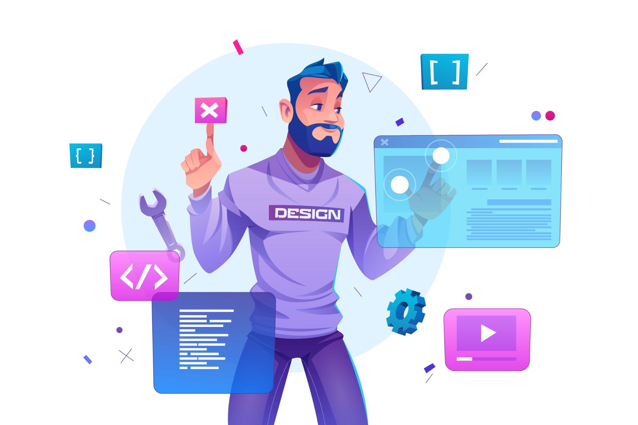
 Web design matter!
Want to keep up to date with upcoming web designing trends?
Designers have begun to produce websites as works of art, dynamic projects, and webpages that are only for amusement and play. This brings to mind the early days of the internet when designers looked for opportunities to flaunt cutting-edge methods or build websites only for their own enjoyment.
Experimenting with the navigation can encourage visitors to browse the site in a particular manner and engage them.
Navigational methods that vary from the norm are referred to as experimental methods. These experimental patterns may serve to attract users' attention and point them in the direction of particular website sections.
Scrolling effects can entice and influence users to keep scrolling.
Web experiences can become more lively by using scrolling animations or scrolling effects. On interactive websites, these are used more frequently to encourage visitors to scroll down, signify a content break, and provide a three-dimensional experience.
Kinetic typeface will captivate visitors and facilitate content assimilation.
Kinetic typography, often known as moving text or animated opening titles, is an animation style that has been used since the 1960s in feature films. A website's homepage might be used for a similar objective to capture a visitor's attention right away. It can also be used to highlight important passages, guide readers as they scroll, and reveal content gradually, like on Arcadia.
With drag interaction, users may feel in charge of their experience.
Drag interactions are designed to mimic a physical, real-world action. In essence, they let users pick up and move everything they view on the screen when browsing websites. Websites, especially e-commerce and portfolio websites, are increasingly using this kind of gesture participation.
Retro typeface can evoke warm, romantic feelings in website visitors.
More and more companies are employing huge, strong typefaces with a retro vibe to headline their home pages. This design works best when there is just one brief word on the page and the rest is kept uncluttered and straightforward.
Cinemagraphs can be used to guide the visitor's attention around the page, even in layouts that are quite complicated.
Cinemagraphshigh-quality looping films or GIFshave grown in popularity as a means to add motion and visual appeal to otherwise static pages.
Layering can give a site depth and enable it to convey the brand's narrative.
incorporating multiple layers of images, colors, shapes, animations, and other components to give a site with little text more depth and character.
Broken grid is a novel technique that can spice up plain website pages or sections.
Although grids are still one of the most popular and effective ways to display text and images on websites, broken grids are becoming more and more widespread and offer a welcome break from the standard.
Organic curves give the design personality without detracting from the information.
Sharp edges and rigid grid layouts are a thing of the past; now, curving lines and rounded, organic shapes are fashionable. Without affecting the way the information is displayed, shapes can assist bring some entertainment.
Users are drawn to a certain area of a website by web textures.
Web textures are background pictures on the internet that simulate a three-dimensional surface. When used effectively, textures can draw users into a website by appealing to their tactile senses, as is the case with Color Of Change, where the background mimics the texture of duct tape.
In this movement, the grid is emphasized as an organizing element.
In recent months, grid lines have proliferated more frequently, and for good cause. Content is organized using grid lines to make it simpler to read and comprehend while also bringing a contemporary style. The Foundations for a Better Oregon website uses grid lines to produce a clean, cutting-edge design.
Overlapping text and graphics conserve page space.
Text that slightly overflows accompanying photographs is a common design element for blogs and online portfolios.
The refinement of a brand is enhanced by thin serif fonts.
Due to screen resolution restrictions and a general lack of online font support, designers have long avoided using serif fonts to maintain the legibility and cleanliness of websites. In 2021, serif typefaces enjoyed a major resurgence thanks to recent developments. Serifs were huge and bold last year, but in 2022, thinner, lighter serifs will be in vogue.
The user experience and website performance can be enhanced by the usage of ultra minimalism.
Some designers are challenging expectations for how a website should look by displaying only the bare minimum, taking traditional minimalism to its logical extreme. The user experience and load times may both benefit from this "ultra-minimalism" trend.
It is important to learn the new trends in web designing for web designers and to keep up to date.
Join GICSEH today!!